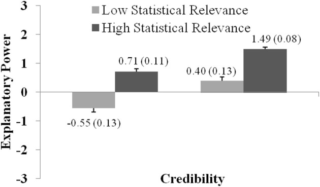
Figure 8.

The graph shows how explanatory power ratings vary with regard to Credibility and Statistical Relevance (as presented in Experiment 5). Ratings were significantly higher for statements with high compared to low Credibility, and for statements with high compared to low Statistical Relevance. The graph shows the (significant) interaction between both factors. Error bars show standard errors of the mean and are also expressed numerically, in parentheses next to the mean value.
