Figure 4.

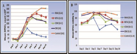
(A) Line chart showing the mean DPSCs count at all time intervals for (G-I) subgroups, (G-II) and (G-III). (B) Line chart showing change in the mean DPSCs viability percentage for (G-I) subgroups, (G-II) and (G III) at all-time intervals

(A) Line chart showing the mean DPSCs count at all time intervals for (G-I) subgroups, (G-II) and (G-III). (B) Line chart showing change in the mean DPSCs viability percentage for (G-I) subgroups, (G-II) and (G III) at all-time intervals