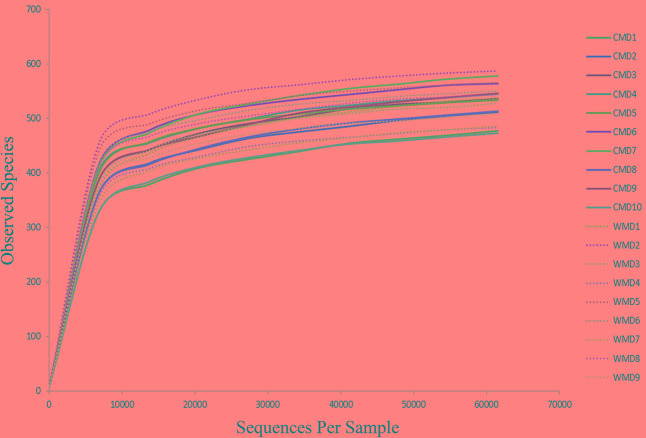
FIGURE 1.
Rarefaction curves. The x-axis shows the number of valid sequences per sample and the y-axis shows the observed species (operational taxonomic units, OTUs). Each curve in the graph represents a different sample and is shown in a different color. As the sequencing depth increased, the number of OTUs also increased. Eventually the curves began to plateau, indicating that as the number of extracted sequences increased, the number of OTUs detected was decreased.

