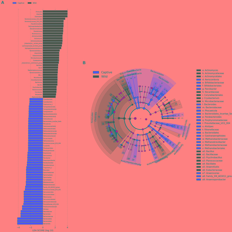
FIGURE 6.
LEfSe analysis. (A) Plot from LEfSe analysis. The plot was generated using the online LEfSe project. The length of the bar column represents the LDA score. The figure shows the microbial taxa with significant differences between the CMD (red) and WMD (green) (LDA score > 2). (B) A cladogram showing the differences in relative abundance of taxa at five levels between CMD and WMD. The plot was generated using the online LEfSe project. The red and green circles mean that CMD and WMD showed differences in relative abundance and yellow circles mean non-significant differences.

