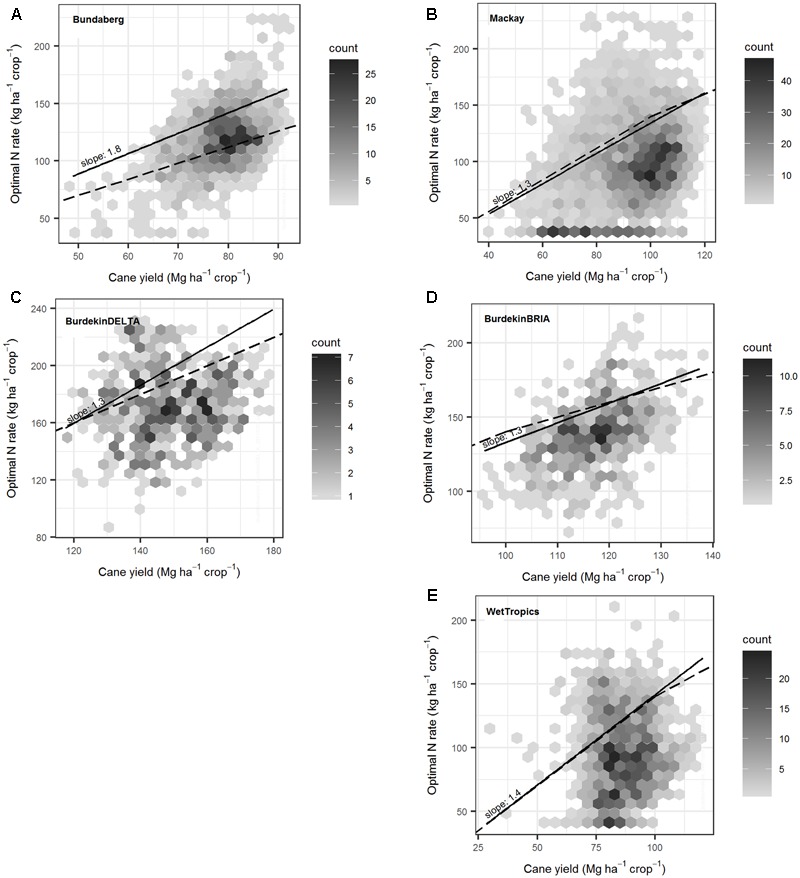
FIGURE 10.

The variation in optimal nitrogen (N; i.e., the N fertilizer rates at which profitability is 99% of maximum) with yield predicted for ratoon crops over 84 years (1928–2011) in five regions (A–E). In all simulations, crops were managed under common practices. In each plot, hexagons contain all the data points located in that region of the figure. The number of points plotted within each hexagon is indicated by the shade of gray of the hexagon (darker shades represent a higher number of points). The solid line indicates the quantile regression fitted to the 80th percentile (with the slope shown), and the dashed line is the general N application rate guideline for sugarcane (Keating et al., 1997).
