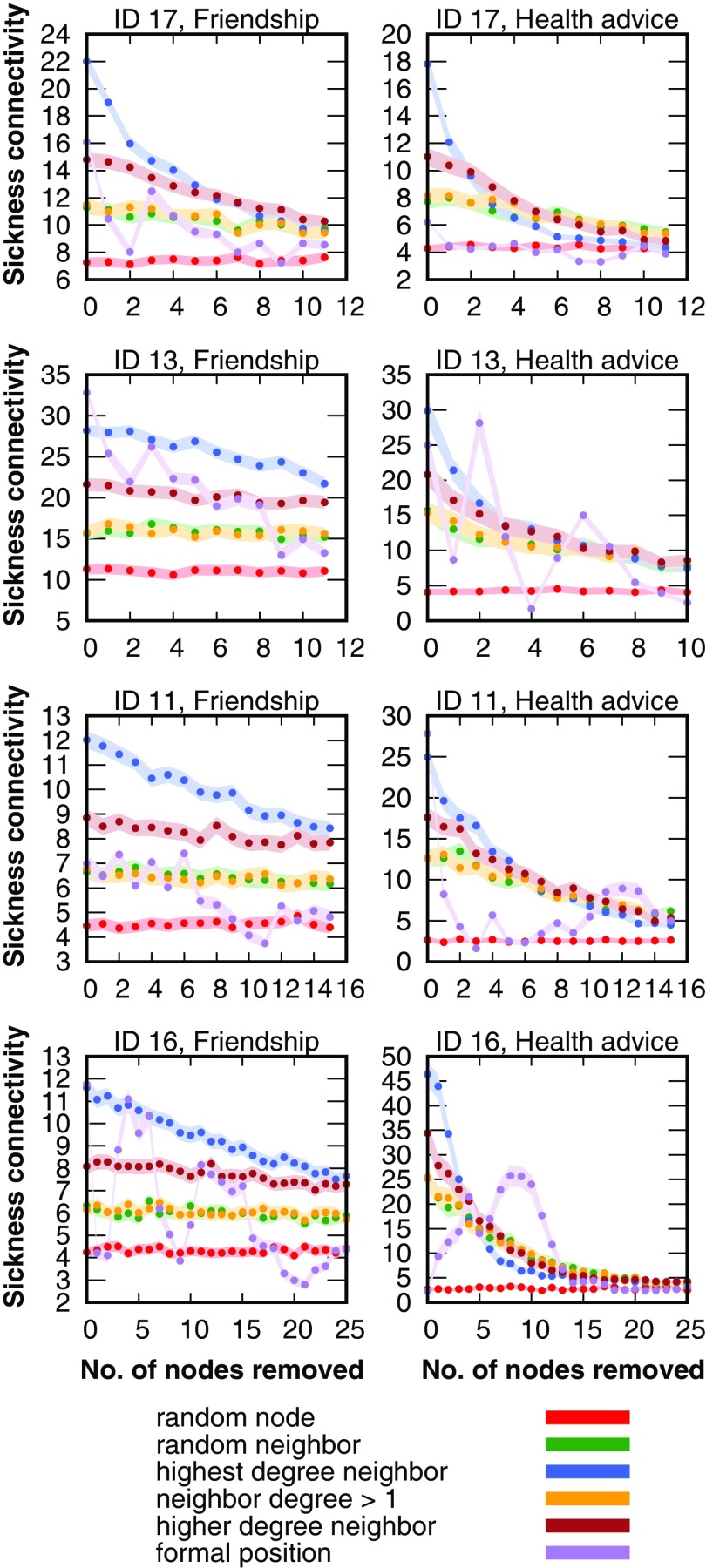
Fig. 5.
Average connectivity to sick people. Four villages are shown that had the fewest, median, 75th percentile, and greatest number of nodes. The remaining villages are shown in SI Appendix, Fig. S6. IDs correspond to project-assigned village IDs. The type of network is labeled accordingly. Sickness connectivity was defined as follows. The number of people in the neighborhood of a node who reported diarrhea within the 3 mo preceding the sociometric survey was divided by the degree of the node of interest. The average sickness connectivity for each node removed is shown up to the number of FPs. One thousand iterations were run and line widths represent 95% confidence intervals.

