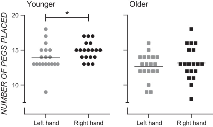
Fig. 1.

Column scatter graphs showing the number of pegs moved on the Purdue Pegboard with the left and right hands for younger (left) and older (right) adults. Each data point represents an individual participant, and the horizontal line in each graph represents the mean. *P < 0.025, Bonferroni correction for multiple comparisons.
