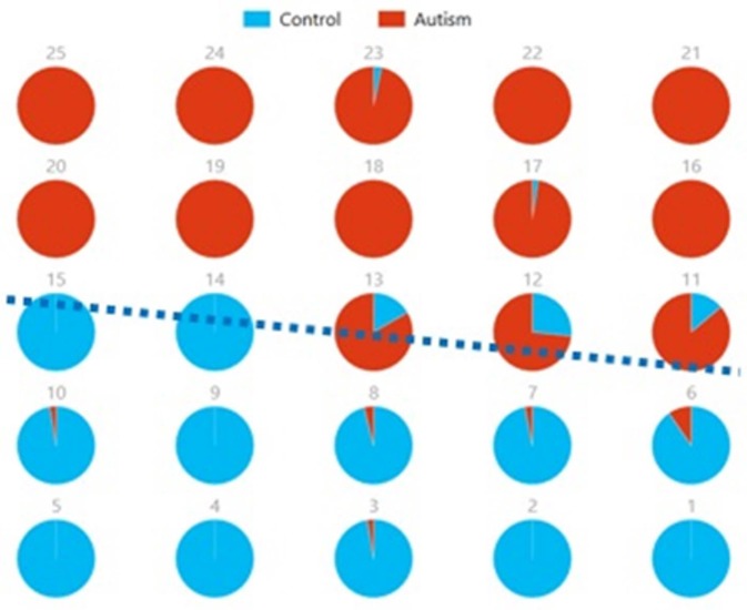
Figure 10.
Pie chart visualizations based on a 5 × 5 SOM for Ax and Cx showing Autism and Control groups by neuron. Each pie chart corresponds to a neuron, represented by the number on each chart, in the SOM map for these components. This map indicates group separation approximately in the middle with Autism group populating the upper while Control the lower half of the SOM, represented by the dotted blue line.

