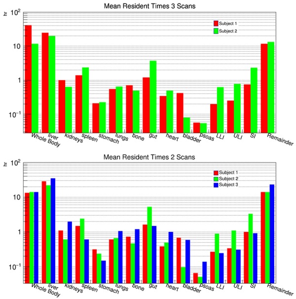
Figure 2.

Bar chart plots of the measured mean resident times for each of the regions contoured on the PET images. The top bar chart plots the mean resident times for the two subjects who were scanned three times and all three scan times were used to generate the time activity curves which were then integrated to extract the mean resident times. The bottom bar chart is the mean resident times for the same regions but only using the first two scans to generate the time activity curves.
