
Fig. 3.
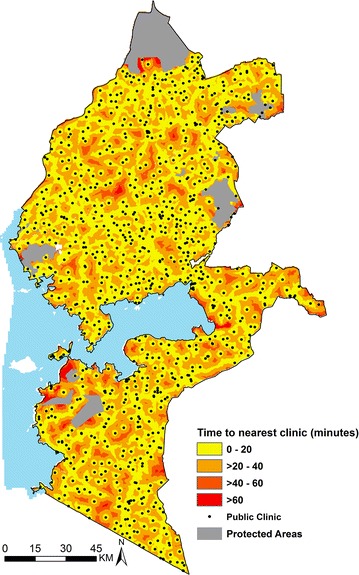
Map of Western Kenya showing travel time (in minutes) from each grid (300 × 300 m) to the nearest public health facility (black dots) distributing LLINs. Grouped travel time increases away from the facilities (yellow to red)
Official websites use .gov
A
.gov website belongs to an official
government organization in the United States.
Secure .gov websites use HTTPS
A lock (
) or https:// means you've safely
connected to the .gov website. Share sensitive
information only on official, secure websites.
Map of Western Kenya showing travel time (in minutes) from each grid (300 × 300 m) to the nearest public health facility (black dots) distributing LLINs. Grouped travel time increases away from the facilities (yellow to red)