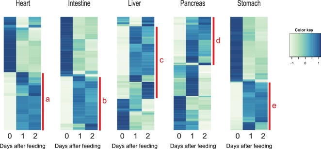
Figure 3:
Heat maps from hierarchical clustering of DEGs in each tissue. Heat maps showing the hierarchically clustered Spearman correlation matrix resulting from comparing the normalized FPKM value for each pair of genes. Heat map columns represent samples, and rows correspond to genes. Expression values (FPKM) are log2-transformed and then median-centred by gene. Relative levels of gene expression are represented by colours. Pale colour is low expression, and darker blue is high expression. Five sub-clusters, labelled a–e, are shown with full annotation in Figs 4–8.

