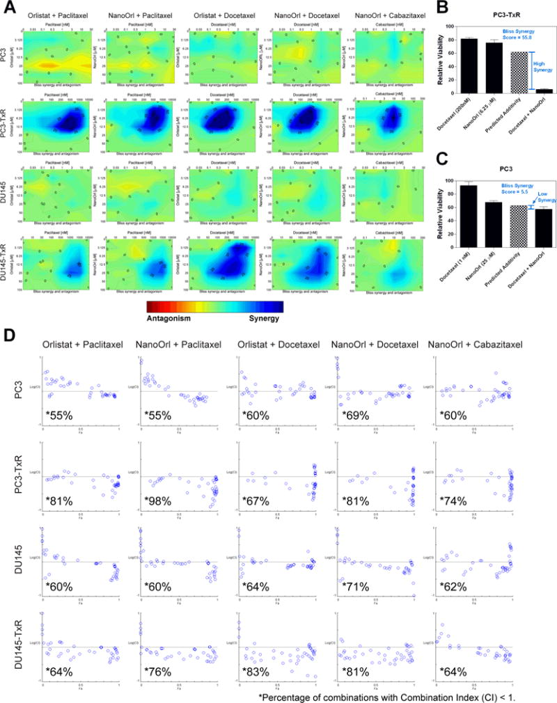
Figure 3. Combinations of orlistat or NanoOrl with taxanes are additive in parent cells, and synergistic in taxane-resistant cells.

(A) Cells were treated as in Figure 2 with the indicated concentrations (taxane concentration above the x-axis, orlistat or NanoOrl concentration along the y-axis) and assessed with CCK-8 assay. Cell viability data was normalized to untreated control wells on each plate. Synergy was analyzed using Combenefit software. Results show the “Contour” view of synergy/antagonism calculations of synergy scores (the difference between the predicted additivity and the observed viability) for the Bliss model. Significant synergy is denoted by dark blue areas, and areas with synergy scores above 25 and 50 are marked. Bar graphs show two examples of the observed single agent and combination relative viability (dark bars), and the predicted additivity (checkered bar) from the Bliss model for (B) PC3-TxR and (C) PC3 cells. (D) Cells were treated as in Figure 2 and 3A, and synergy of the normalized data was analyzed using CompuSyn software. Results show synergy/antagonism plotted as the Log(combination index) [Log(CI)] on the y-axis vs the Fraction affected (Fa) on the x-axis. Combinations with CI value <1 are synergistic and are plotted below the horizontal line, combinations with CI=1 are additive and are plotted on or near the horizontal line, and combinations with CI>1 indicates antagonism, and are plotted above the horizontal line. The percentage of combinations with CI < 1 for each cell line treated with the indicated drugs are marked with *.
