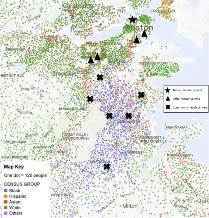
Figure 3.
Mapping black Boston. Map of Boston showing where the different racial/ethnic groups live in relation to the cancer centers and community health centers. Health centers shown have patient populations that are 55%–76% black. (Adapted from NYTimes Mapping Segregation Project [27])

