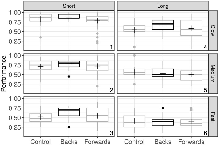
Figure 2.
Box-plots summarizing the data grouped over Speed (rows), Time (columns) and Observer's group (X axis). Each plot represents Performance (the probability of a Good response) for the three groups of observers. Crosses indicates mean values, and the numbers in the right bottom corners of the plots represent the particular combination of Speed and Time that codifies the task difficulty (Condition).

