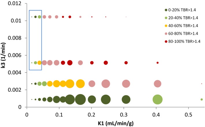
Figure 5.

Bubble plot showing clustered k 3 versus K 1 values. Bubble size indicates the number of points in each cluster. Bubbles are colored according to the proportion of voxels with TBR (4 h p.i.) > 1.4. The blue box highlights a region of the graph in which k 3 values are high, but less than 60% (generally < 40%) of voxels have TBR > 1.4.
