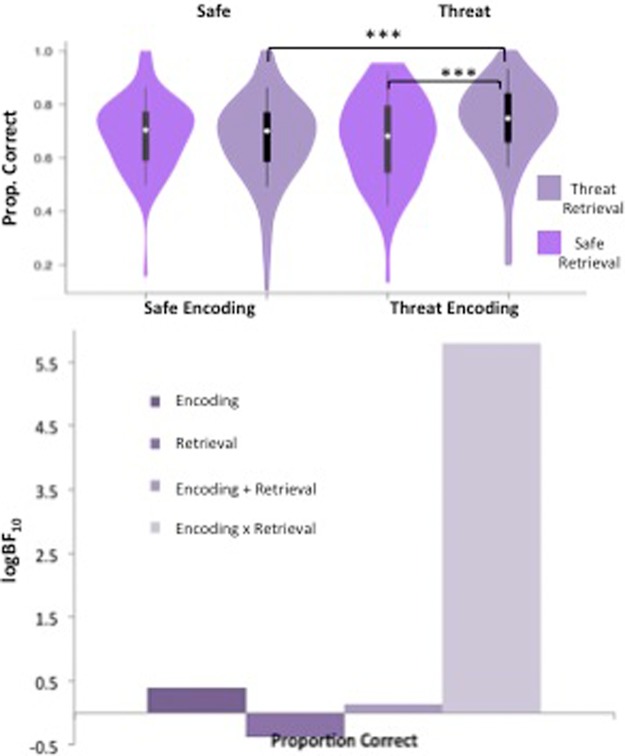
Figure 1.
Spatial span task results. Violin plots displaying participants’ average anxiety ratings (for safe versus threat) and proportion correct for each condition, and bar charts representing the Bayesian model evidence for proportion correct for each condition. For the violin plots (and all those subsequent), the density estimates of data are shown; white circles represent the medians; boxes indicate the 25th/75th percentiles with whiskers extending ×1.5 the interquartile range.

