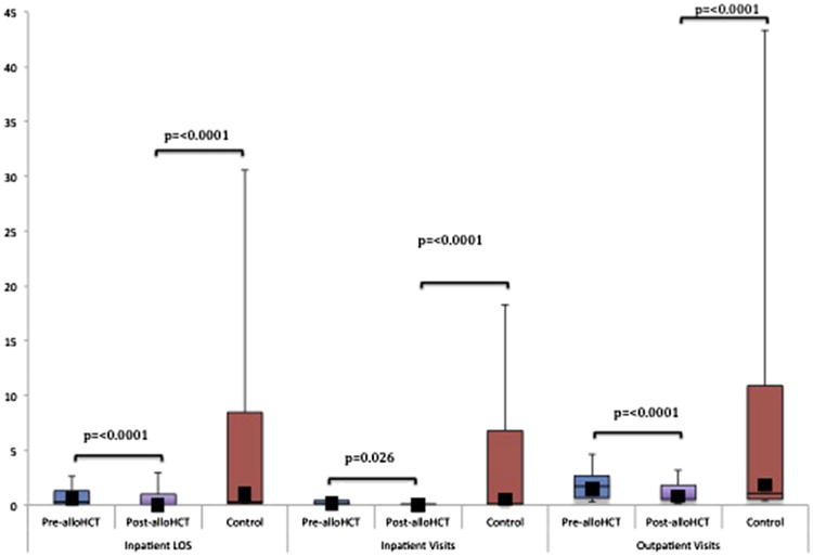
Figure 1.

Overall post-alloHCT HCU per patient per month compared with pre-alloHCT and control subjects. The horizontal lines that form the top and bottom of each box are the 75th and 25th percentiles, respectively. The horizontal line that intersects the box is the median. The whiskers represent the minimum and maximum ranges. The solid squares represent the mean values. (See Supplemental Table 1 for exact HCU figures.)
