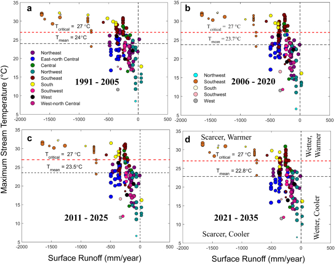
Figure 3.
Scatter diagrams between indicators of water stress. (a–d) Scatter plots showing the relationship between mean surface runoff and maximum stream temperature for nine climatologically homogeneous regions, each shown by different colors, for current (1991–2005) and future time periods (2006–2035). The size of the color-filled circles represents strength of the association, as measured by Kendall’s tau (shown in Fig. 2), between surface runoff and water temperature. For a given region, nature of the association is captured by the different shades of the color; darker (lighter) shades or negative (positive) values of Kendall’s tau represent inverse (direct) relationship. The two dotted horizontal lines are drawn at the ensemble mean of stream temperatures and a critical water temperature limit of 27 °C (a limit over which water is not suitable for cooling; it is ~5 °C lower than the Environmental Protection Agency [EPA] prescribed maximum allowed temperature of ~32 °C). The vertical dotted line is drawn at no flow. The left side of the vertical line represents water scare situations, and the side above 27 °C represents warmer. Each of the scatter plots is divided into four quadrants: scarcer, warmer (top left); scarcer, cooler (bottom left); wetter, warmer (top right); and wetter, cooler (bottom right) as shown in (d). The partitioning of the scatter diagrams explicitly identify regions with hot spots – a combination of low flow and high temperature. The figure legend at (a) indicates negative values of Kendall’s tau whereas at (b) shows positive values. Legends are same for all panels. Figures were generated using MATLAB 2015a (Version 8.5, http://www.mathworks.com). Finally, all these figures are organized and labelled in Adobe Photoshop CS Desktop (Version 5.1, https://www.adobe.com) [Software].

