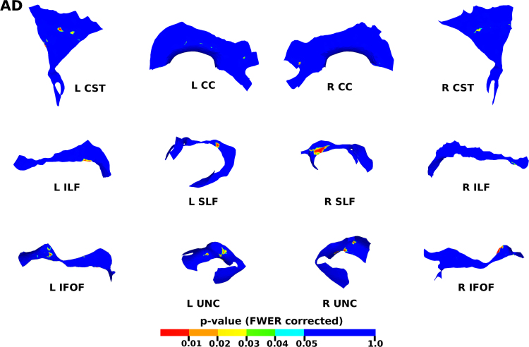
Fig. 11.
The results of the cluster analysis correlating PMA with AD at each point within the tracts. Statistically significant regions are shown in red (p≤0.01), orange (0.01<p≤0.02), yellow (0.02<p≤0.03), green (0.03<p≤0.04) and light blue (0.04<p≤0.05). (For interpretation of the references to color in this figure legend, the reader is referred to the web version of this article.)

