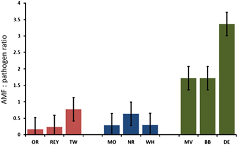
Figure 4.
The AMF/pathogen ratio changing in time since agricultural abandonment. The recently abandoned fields are marked as red bars, mid-term abandoned fields as blue and long-term abandoned fields with green. The bars represent averages and error bars represent s.e. The full colour version of this figure is available at ISME Journal online.

