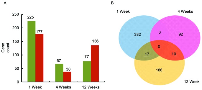
Figure 1.
Comparision of differentially expressed genes at the three timepoints. (A) Historgram graph demonstrating the number of upregulated and downregulated genes at three time points. Green represents upregulated genes and red represents downregulated genes. (B) Venn diagram of the number of genes at each timepoint. Blue represents 1 week, pink represents 4 weeks and yellow represents 12 weeks.

