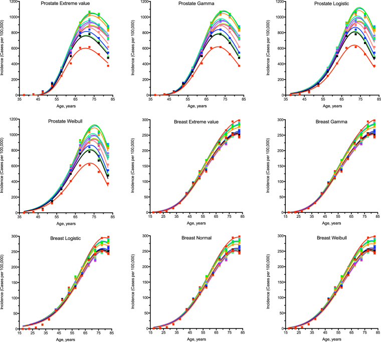
Figure 1.
Comparison of different statistical distributions with actual distributions of prostate and breast cancer incidence by age. Dots indicate actual data for 5-year age intervals, curves indicate PDFs fitted to the data. The middle age of each age group is plotted. Different colours indicate different years of observation, from 1999 to 2012. The fitting procedure was identical for all distributions. The normal distribution did not converge for prostate cancer. Prostate and breast cancers were selected due to being the highest-incidence gender-specific cancer types.

