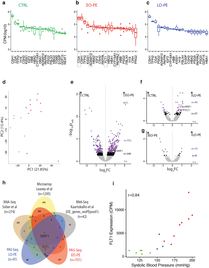
Figure 3.
Differential gene expression analysis. Box-plots of top twenty most abundant transcripts in (a) CTRL, (b) EO-PE, and (c) LO-PE patients. Gene expression measured as Counts Per Million (CPM) mapped reads. Dark bar: median; box: 25–75% interquartile; whiskers and dots: range. (d) Principal component analysis (PCA) of highly variable genes. Axes are principal components 1 and 2 (PC1 and PC2). Each point represents a single patient, with colors indicating the patient type as in Fig. 1a. Volcano plots showing differential gene expression for (e) CTRL vs. EO-PE, (f) CTRL vs. LO-PE, and (g) EO-PE vs. LO-PE. X-axis: log2 Fold Change (FC) between samples; Y-axis: -log10 false discovery rate after false positive removal (padj). Each dot is a gene: purple, padj ≤ 0.01; black, padj ≤ 0.05; n, number of genes in each group. (h) Venn diagram illustrating overlap of differentially expressed genes (padj cutoffs as indicated) between our EO-PE and LO-PE PAS-Seq datasets, two published RNA-Seq datasets37,46 and a large meta analysis of available microarray data47. (i) Scatter plot of FLT1 RNA expression (CPM) vs. Systolic Blood Pressure (mmHg). Each point represents a single patient, with colors indicating the patient type as in Fig. 1a.

