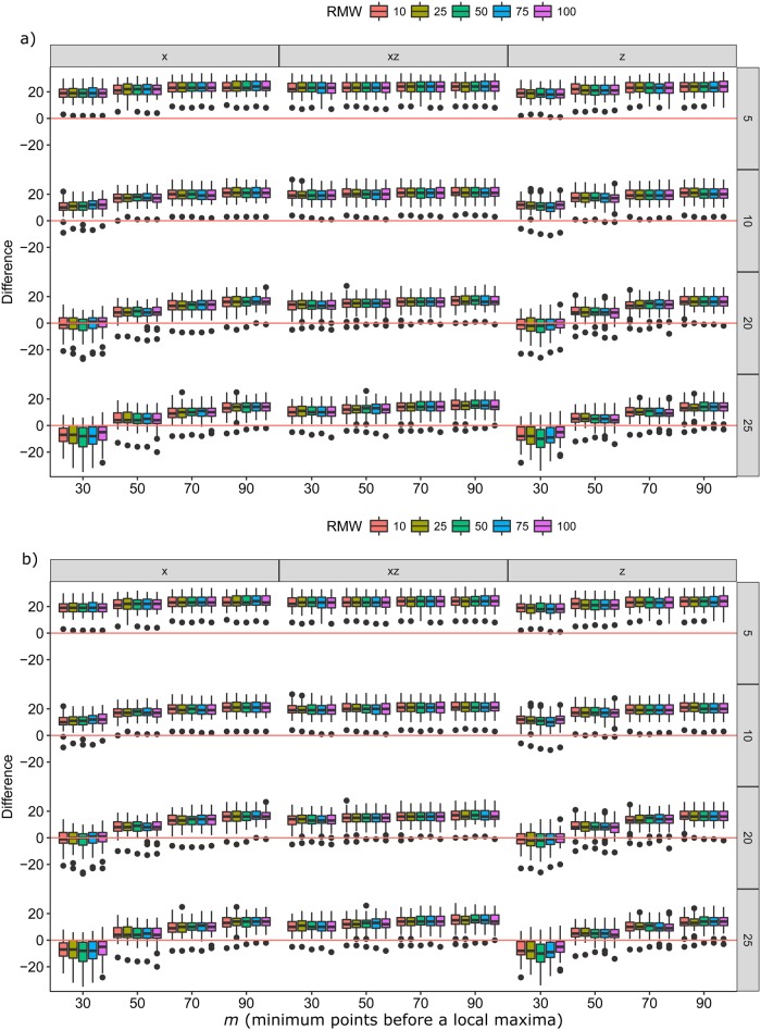
Fig. 2.
Boxplots of differences (z-axis) between predicted stroke rate and actual stroke rate over different RMW (coloured boxes) and m (x-axis) for the three axes tested (x, z, x+z) and different sampling frequencies (HZ, y-axis). Red lines indicate where there is 0 difference between observed strokes and predicted strokes. (A) Otariids with the accelerometer taped on (N=49 trials); (B) otariids wearing a harness with the accelerometer (N=71 trials).

