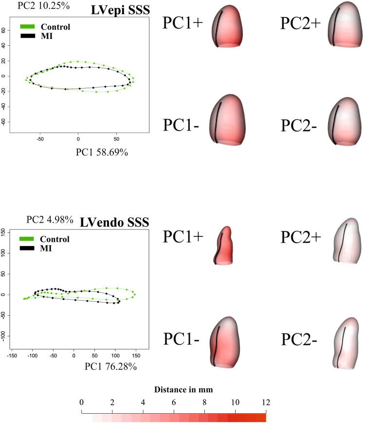
Figure 2.
Results of GPA + PT + PCA for epicardium and endocardium in SSS. For visualization purposes, only one per-group mean trajectory (300 Controls vs 300 MI) is shown. The colormap ranges from white (=no deformation) to red (=max) and refers to || xM-x || with xM the position at the Grand Mean and x its position at the PC axis extreme. The black line indicates the position of inter-ventricular septum. The first three PCs are used as “landmarks” in the trajectory analysis taking into account all 600 trajectories present in the dataset. See Supplementary Files 3 and 4 for dynamic visualization of trajectories and associated shape changes. Shapes are predicted at the positive and negative axes’ extremes.

