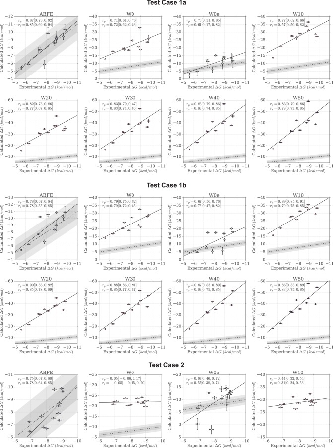
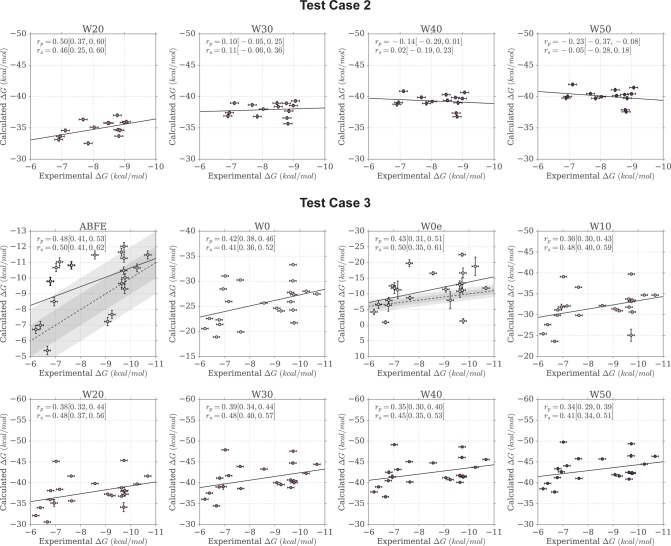
Figure 3.
Scatter plots of calculated versus experimental binding free energies. The areas shaded in gray indicate the 1 and 2 kcal/mol error boundaries. A linear fit to the data is shown as a black line, whereas a dashed line shows the identity line representing a perfect linear fit between experiment and calculations.


