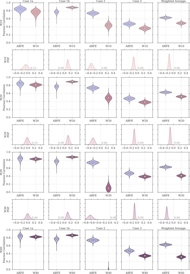
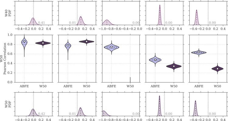
Figure 8.
Distributions of Pearson correlation values for the protocols W10 to W50 and for ABFE calculations, obtained by bootstrap and based on the uncertainties of the experimental affinity measurements and computational predictions. In the violin plots, the white circle represents the rp value of the original sample, whereas the dashed horizontal lines the first, second, and third quartiles of the bootstrap distribution. The probability density on the even rows show the distribution of rp for ABFE subtracted from the distribution of rp for MMPBSA. The fraction of the area above or below zero is reported on the plots, the median is shown as a dashed line, and a difference value of zero is marked with a vertical gray dotted line.


