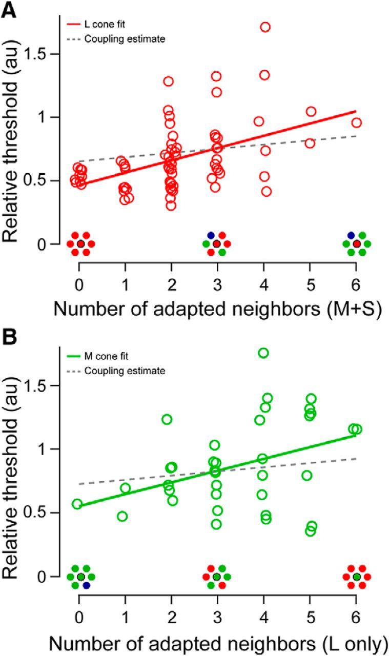
Figure 3.

Relationship between cone thresholds and spectral demographics of neighboring cones. A, L cone thresholds measured against a short-wavelength background increase with each additional preferentially activated (M or S) neighboring cone. Data from S1 and S2 are combined as described in the text. Solid line is a linear regression to the data (slope = 0.10; r2 = 0.23; p < 0.001). Dashed line is the maximum estimated neighborhood effect resulting from electrical coupling between all adjacent cones (coupling slope = 0.033, corresponding to a 3.3% increase in baseline activity per opposite-type neighbor; see Materials and Methods). B, M cone threshold data analyzed as in A measured against a long-wavelength background. Thresholds also increased as the cone neighborhood became more spectrally opponent (slope = 0.09; r2 = 0.14; p = 0.023).
