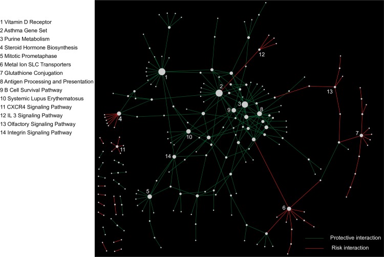
Fig 5. Network view of the between-pathway interactions (BPM) from the consensus analysis.
All BPMs satisfying a geometric mean p ≤ 5.0 × 10⁻⁴ threshold from consensus analysis are plotted. Red edges indicate interactions associated with increased breast cancer risk while green edges indicate interactions associated with decreased risk. Node size is proportional to the number of BPMs connected to each pathway. Several of the highly connected pathways are labeled by numbers, and their corresponding pathway names are listed. The complete information for these pathways can be found in S5 Table.

