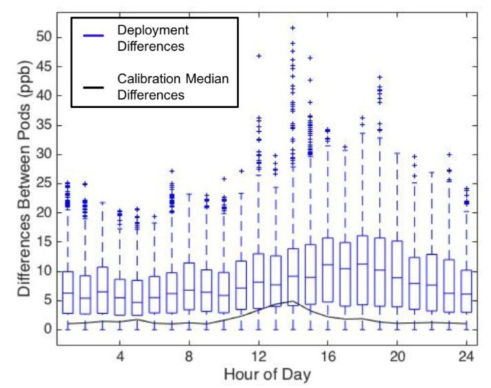
Figure 5.
Differences between all campus UPods binned by hour, with differences displayed as absolute ppb. The graphic includes the boxplot of the differences during the deployment (blue outlined boxes), and the median differences of the calibration data (solid black line). Whisker lines (blue) encompass 1.5 times the IQR, and outliers (blue crosses) indicate data points lying outside 1.5 times the IQR of the deployment data.

