
Fig. 2.
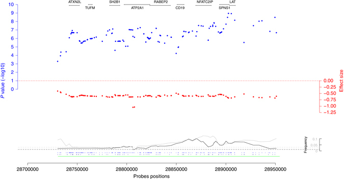
Regional association plot for the 16p11.2 220 kb rearrangement. The blue dots represent −log10 BMI-association P values, the red dots show the corresponding effect sizes. At the bottom the black and gray lines are the deletion and duplication frequencies. Finally, the dots at the bottom indicate the probe positions for the GIANT cohorts (above) and the UK Biobank (below). Positions of the protein-coding genes are shown at the top of the plot. The probes positions correspond to the human genome build 36