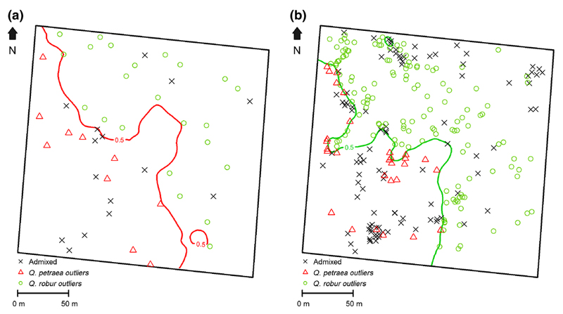
Fig. 2.
Distribution of admixed and “outlier” trees in cohort 1b (Fig. 2a) and in cohort 2 (Fig. 2b).
Contour lines of cohort 1b and cohort 2 are reproduced from Fig. 1c and Fig. 1b. Admixed trees were not considered for plotting the contour line. Admixed were located on the map once the contour line was plotted (see text).
a Distribution of admixed and “outlier” trees in cohort 1b.
b Distribution of admixed and “outlier” saplings in cohort 2.

