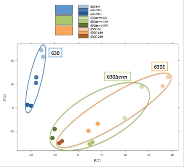
Figure 6.

Principal Component Analysis (PCA). The Principal Component Analysis (PCA) visualizes the variance of the data in a single graph. The axis represent the 2 largest variances of the data; PC1 accounts for 42% and PC2 accounts for 21%, that means that 63% of the total variance of the dataset is explained in this graph. The third component accounts for less than 10% and further components have a value that falls rapidly. The PCA represents the RNAseq data (at 3 different time points, 6, 14 and 24 h) in duplicate for 630 (blue), 630Δerm (green) and 630E (orange). The different time points are represented as dots in the different shades of the respective color as indicated in the color legend.
