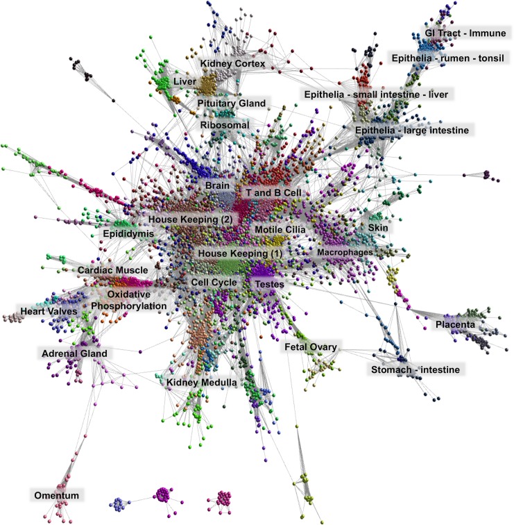
Fig 2. Network visualisation and clustering of the sheep gene expression atlas.
A three-dimensional visualisation of a Pearson correlation gene-to-gene graph of expression levels derived from RNA-Seq data from analysis of sheep tissues and cells. Each node (sphere) in the graph represents a gene and the edges (lines) correspond to correlations between individual measurements above the defined threshold. The graph is comprised of 15,192 nodes (genes) and 811,213 edges (correlations ≥0.75). Co-expressed genes form highly connected complex clusters within the graph. Genes were assigned to groups according to their level of co-expression using the MCL algorithm.

