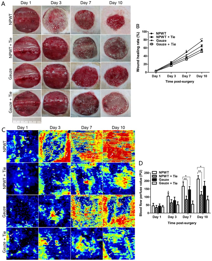
Figure 1.
Wound healing rate and changes in blood flow in the different groups. (A) The macroscopic wound healing process in the different groups. (B) Statistical analysis of wound healing rate in the 4 groups. (C) The changes in blood flow perfusion in the different groups during wound healing. The areas of yellow and red in the image represent the quantity of blood flow in the wound (white arrow), as well as the areas of blue imply less or no blood flow (white arrow). (D) Statistical analysis of blood flow perfusion value in the different groups. All data are expressed as the means ± SD (*P<0.05 and **P<0.01).

