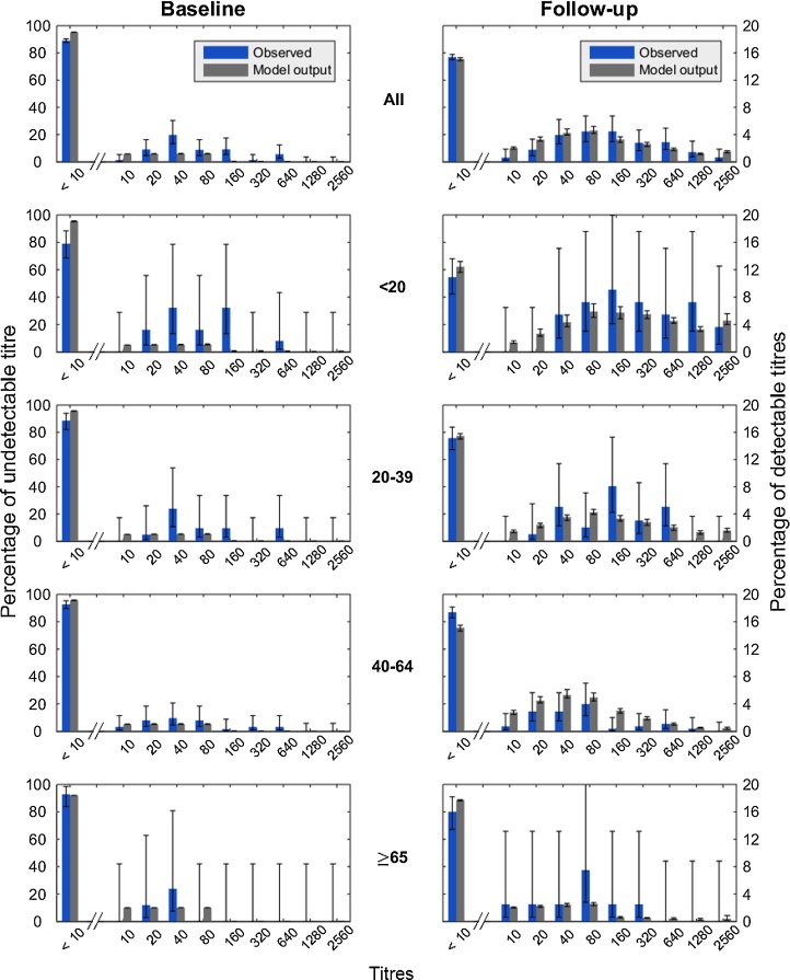
Fig. 1.
Comparison of titre model fit (gray) and observed (blue) age-stratified data for baseline and follow-up surveys. The top row describes the pattern for the entire population, while the bottom four rows describe patterns for specific age groups. Vertical bars indicate 95% binomial confidence intervals (observed) and 95% region of posterior credibility (model). Left y-axis indicates the percentage with undetectable titre. Right y-axis indicates percentages in other titre classes. Note left and right y-axis are different scales. (For interpretation of the references to colour in this figure legend, the reader is referred to the web version of the article.)

