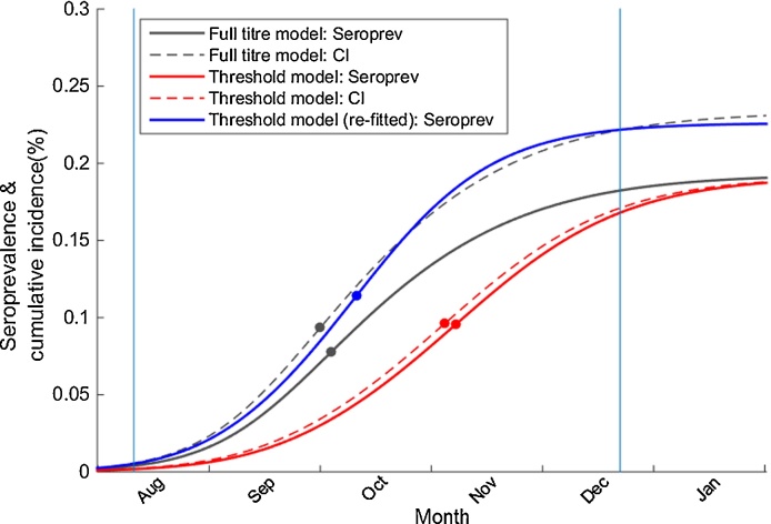
Fig. 4.
The seroprevalence and cumulative incidence by time reconstructed from the models outputs. Gray, solid and dashed lines represent seroprevalence and cumulative incidence produced by the full titre model (model A). Red, solid and dashed lines represent seroprevalence and cumulative incidence produced by the threshold model (model E). The slight difference between cumulative incidence and the seroprevalence in the threshold model is caused by the assumption that only healthy persons (individuals not in infected status), would participate in the serosurveillance survey. The blue line represents the seroprevalence produced by re-fitting the threshold model to the cumulative incidence generated from the full titre model at T2. The dot represents the time when the maximum slope is achieved, corresponding to the peak of the respected epidemic curve. (For interpretation of the references to colour in this figure legend, the reader is referred to the web version of the article.)

