Fig. 2.

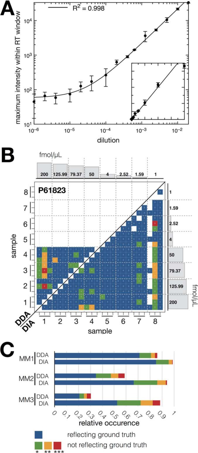
Label-free pyQms quantification of metabolites and peptides. (A) Dilution series of chemically synthesized adenosine (axes plotted in log scale), each dilution comprising three technical replicates. Line shows the linear regression function (R2 = 0.998). Inset shows axes plotted in linear scale; x-axes, dilution of nucleoside; y-axes, maximum intensity. (B) Example of the statistical evaluation of pyQms peptide quantifications of the Bruderer et al. data sets (DDA, top left; DIA, bottom right). Shown is the heat map for spiked-in protein P61823 (ribonuclease pancreatic, Bos Taurus, master mix 2). The colors reflect the p value for the two-sided t test obtained after testing whether the calculated peptide ratios between two samples (x and y axes, eight samples, ticks represent each three technical replicates) differ significantly from the ground truth ratios. Histograms at the axes show the spiked-in protein concentrations for the eight samples (master mix 2, for sample setup and other master mix composition refer to Supplemental Fig. 1 and Bruderer et al. (34), x-axes, sample; y-axes, concentration of spiked-in proteins. The number of peptide charge combination ratios (for DDA samples) or peptide ratios (DIA) used for the t test are shown as numbers in the bins. (C) Stacked bar plot for relative occurrences of the p values over all 12 spiked-in proteins across all three master mixes (MM1, MM2, and MM3). Legend: x axis, relative occurrence of p value; y axis, master mix, and data acquisition method combination (DDA or DIA). p value legend for (B) and (C), blue: reflecting the ground truth; green (p value ≤0.05), yellow (p value ≤0.01), and red (p value ≤0.001): not reflecting the ground truth.
