
Figure 3.
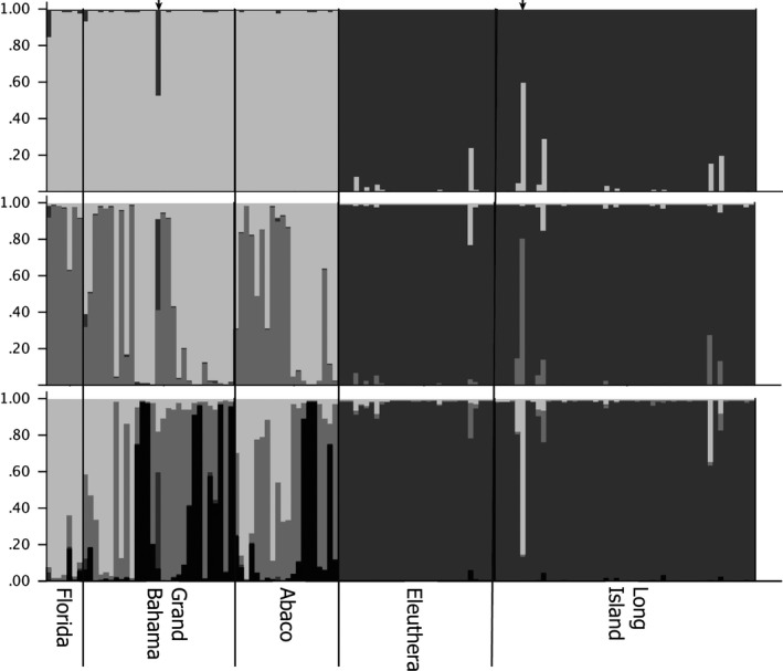
Structure plots under assumptions of k = 2 (top), k = 3 (middle), and k = 4 (bottom). Each vertical bar along the x‐axis represents the genotype of an individual, sorted by their sampling locality. The y‐axis indicates the proportion of the genotype that belongs to a given number of clusters (k). Each cluster is indicated with a different color. The two small arrows on top of the k = 2 plot indicate UF33074 (left) and UF31901 (right; see text for further information)