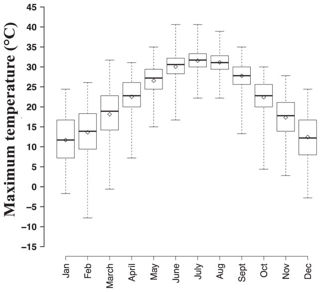
Figure 1.
Monthly distribution of maximum temperature values during 1993–2012. Each box represents the distribution of daily maximum temperature values by month across all years. Solid black lines represent 50th percentile values and hollow diamonds represent monthly means. Boxes represent the 25th to 75th percentile values of maximum temperature and whiskers range from minimum to maximum values for each month.

