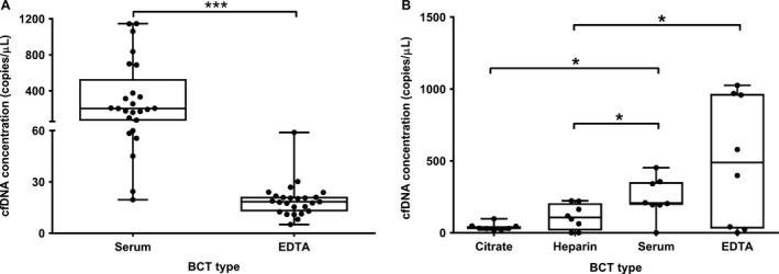
Figure 2.

Comparison of cfDNA concentrations in paired blood samples in four different BCTs. All samples originated from healthy controls collected. In all experiments assay, 1 was used during ddPCR. The boxplots indicate cfDNA concentrations on the y‐axis, comparing serum with EDTA BCTs from 25 healthy controls on the x‐axis (A), and citrate, heparin, serum, and EDTA BCTs from eight other healthy controls (B). The crossing lines indicate medians, the upper and lower limits of the boxes indicate interquartile ranges (25th/75th percentiles), and whiskers represent minima and maxima. *P < 0.05,***P < 0.001.
