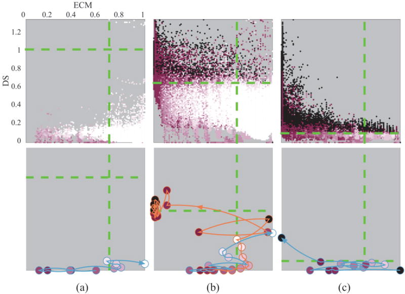
Fig. 5.
Niche-phenotype map corresponding to the simulations presented in Fig. 4, representative of the range of pathological stages: (a) well differentiated (DCIS), (b) moderately differentiated, (c) poorly differentiated. Color-coded Di phenotype for all cells against their DS and ECM values for all time steps of the simulation (first row). It is possible to identify regions corresponding to a cancer-promoting niche versus a normalizing one (black vs white areas). Green lines indicate thresholds f̄ and c̄. The dynamic nature of the niche can be better appreciated by following the path of a representative single cell lineage trajectory (orange/blue lines) in the DS-ECM space, for each of the corresponding simulations (second row). Color-coded circles along these lines indicate changes in Di over time.

