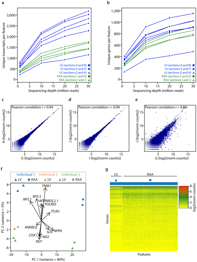
Figure 2.
Gene expression patterns within and between individuals. (a,b) Saturation curves showing numbers of unique transcripts (a) and unique genes (b) per feature, against subsets of raw reads. (c and d) Scatterplots showing Pearson correlation of gene expression between consecutive tissue sections from LV and RAA. (e) Scatterplot showing Pearson correlation of gene expression between different cardiac regions of the same individual. Letters correspond to tissue sections specified in Table 1. (f) Principal Component Analysis score plot showing separation of LV and RAA sections along PC1, and separation of individuals along PC2. Loadings show genes that make a major contribution to the separation. (g) Heatmap of gene expression across all features from one LV and one RAA tissue section from individual 1.

