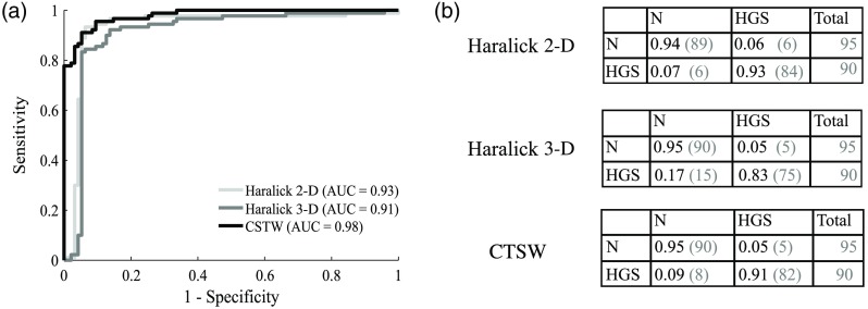
Fig. 5.
Classification performances for healthy versus HGS specimens: (a) ROC curve for each method with the corresponding AUC and (b) confusion matrices showing the fraction of samples being correctly classified on the diagonal and the number of misclassified samples in the off-diagonal elements. The number in parenthesis is the actual number of specimens with the column labeled “total” presenting the total number of samples in each class.

