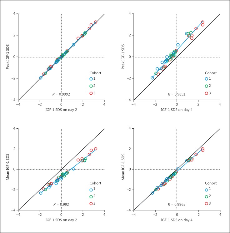
Fig. 8.
Peak (top panels) and mean (bottom panels) IGF-1 SDS for each subject is plotted against the value at day 2 (left) or day 4 (right). All values are obtained from a simulation based on the optimal model. Colors distinguish cohorts. The line of identity (in black, at 45°), a regression line (blue), and the correlation coefficient are shown. Vertical and horizontal dotted lines appear at 0 SDS units.

