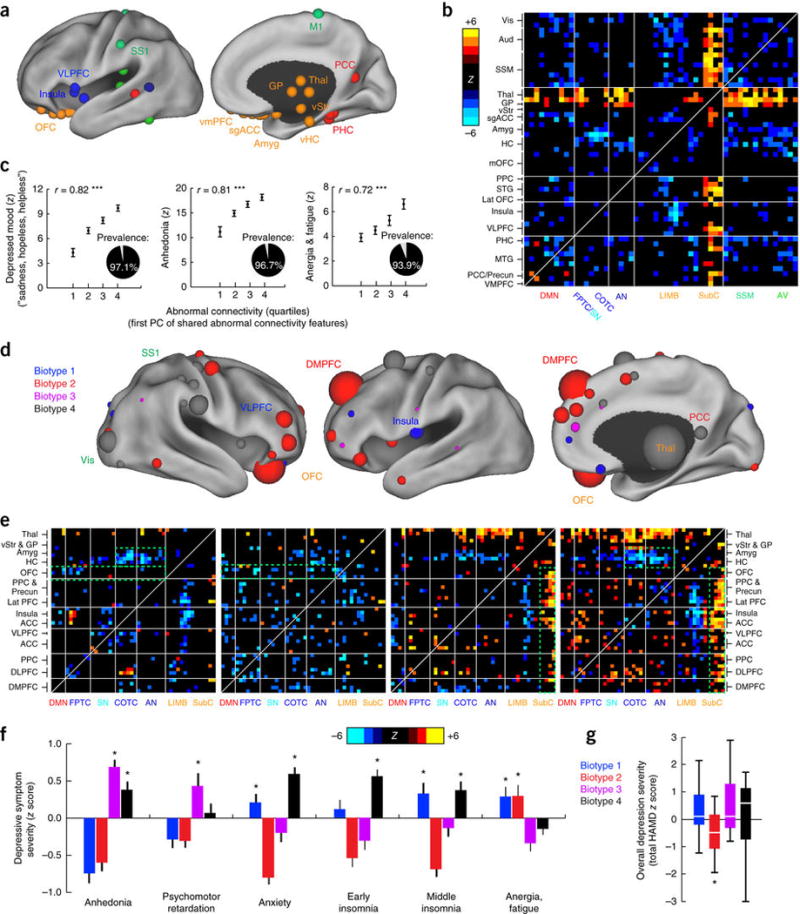
Figure 2. Connectivity biomarkers define depression biotypes with distinct clinical profiles.

(a) Neuroanatomical distribution of the 25 ROIs (top 10%) with the most abnormal connectivity features shared by all four biotypes (summed across all connectivity features for a given ROI), identified using Wilcoxon rank–sum tests to test for connectivity features that were significantly abnormal in all four biotypes relative to healthy controls in data set 1 (n = 378). ROIs are colored by network, as in Figure 1a. (b) Heat maps depicting a pattern of abnormal connectivity (P < 0.05, false-discovery rate (FDR) corrected) shared by all four biotypes for the top 50 most abnormal ROIs, colored on the basis of Wilcoxon rank–sum tests comparing patients and controls, as in a. Warm colors represent increase and cool colors decrease in depression as compared to controls. (c) Correlations (r = 0.72–0.82, ***P < 0.001, Spearman) between shared abnormal connectivity features (as indexed by the first principal component (PC) of the features depicted in b and the severity of the core depressive symptoms. Insets depict the prevalence of each symptom. Symptom severity measures are z-scored with respect to controls and plotted as the mean for each quartile, ± s.e.m. (d) Neuroanatomical distribution of dysfunctional connectivity features that differed by biotype, as identified by Kruskal–Wallis analysis of variance (ANOVA) (P < 0.05, FDR corrected), summarized for the 50 ROIs (top ~20%) with the most biotype-specific connectivity features (i.e., the 50 ROIs with the largest test statistic summed across all connectivity features, showing cluster specificity at a threshold of P < 0.05, FDR corrected). Nodes (ROIs) are colored to indicate the biotype with the most abnormal connectivity features and scaled to indicate how many connectivity features exhibited significant effects of biotype. (e) Heat maps depicting biotype-specific patterns of abnormal connectivity for the functional nodes illustrated in d, plus selected limbic areas, colored as in b. Green boxes highlight corresponding areas in each matrix discussed in the main text. (f) Biotype-specific clinical profiles for the six depressive symptoms that varied most significantly by cluster (P < 0.005, Kruskal–Wallis ANOVA). Symptom severities (HAMD) are z-scored with respect to the mean for all patients in the cluster-discovery set. See Supplementary Figure 4 for all 17 HAMD items and for replication in data from subjects left out of the cluster-discovery set. (g) Boxplot of biotype differences in overall depression severity (total HAMD score), in which boxes denote the median and interquartile range (IQR) and whiskers the minimum and maximum values. In f and g, asterisk (*) indicates significant difference from mean symptom severity rating for all patients (z = 0) at P < 0.05; error bars depict s.e.m.; n.s., not significant. Aud, auditory cortex; HC, hippocampus; lat PFC, lateral prefrontal cortex; lat OFC, lateral orbitofrontal cortex; MTG, middle temporal gyrus; PHC, parahippocampal cortex; PCC, posterior cingulate cortex; SSM, primary sensorimotor cortex (M1 or S1); STG, superior temporal gyrus; vis, visual cortex. Other abbreviations are as in Figure 1. See Supplementary Table 5 for Montreal Neurological Institute coordinates for ROIs in a and d.
