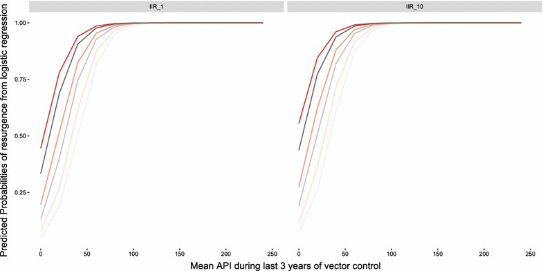
Fig. 5.

Predicted probabilities of resurgence based on logistic regression results plotted against the mean API during the last 3 years of vector control (years 9–12). Darker lines represent increasing EIR (0.1, 1, 2) while red-orange lines represent active surveillance coverage of 1% per quarter and grey lines represent active surveillance coverage of 10% per quarter. The plot on the left is for an IIR of 1 imported infection per 1000 people per year while the plot on the right is for an IIR of 10 imported infections per 1000 people per year. All slopes here are for LLIN coverage of 80%, case management coverage of 50% and using the base model variant
