
Figure 1. Comparison of MAGE and PPGEs between underweight or normal-weight patients (Group A) and overweight or obese patients (Group B): using box-and-whisker plot.
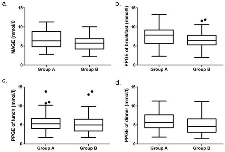
Abbreviations: MAGE, mean amplitude of glycemic excursions; PPGEs, postprandial glucose excursions. The box contained 50% of all values (from 25th to 75th percentile) and was divided by the horizontal bar of the median value (50th percentile). The whiskers showed the remainder of the distribution (1.5 × Inter Quartile Range). Outliers were shown as dots.