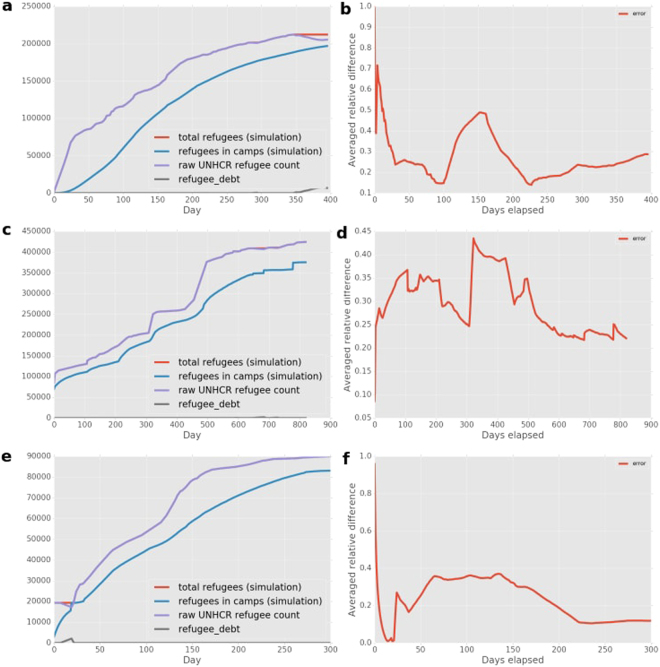
Figure 3.
Comparison of number of refugees in camps between the simulation and the data (left column), and overview of the averaged relative difference between simulation and data (right column). The averaged relative difference across camps between simulation and data is given by the red line. We provide these comparisons respectively for (a,b) the Burundi simulations (top row), (c,d) the CAR simulations (middle row) and (e,f) the Mali simulations (bottom row).

