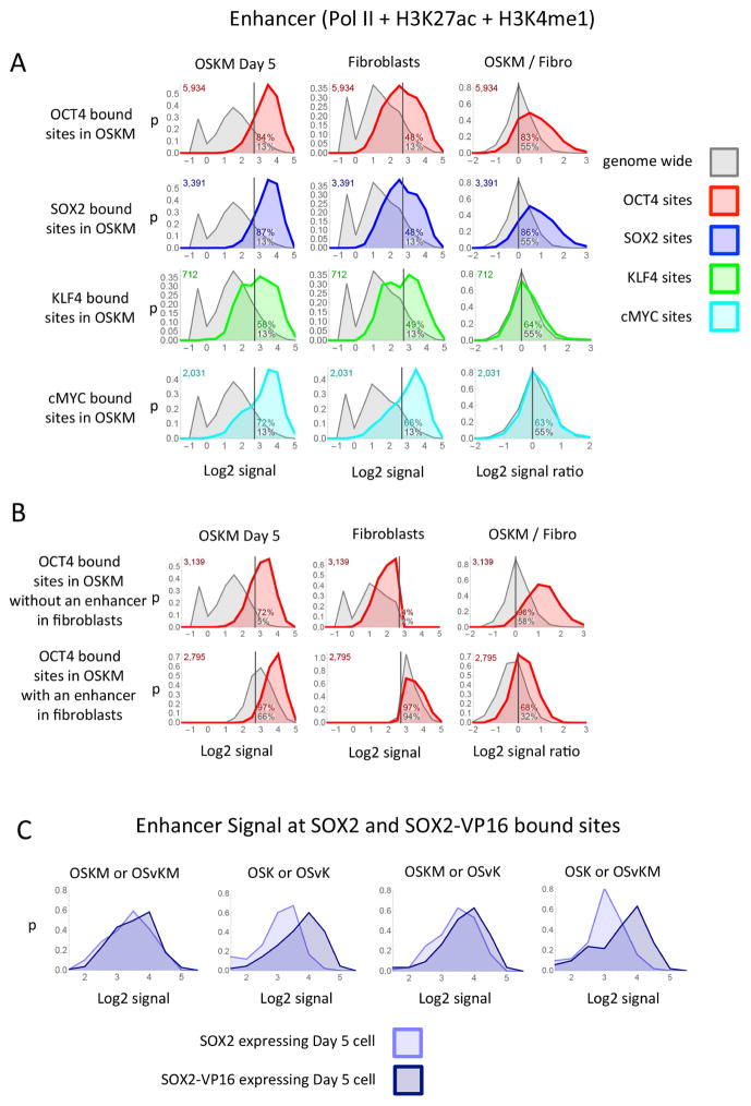
Figure 5. Putative enhancers at transcription factor binding sites.
(A) Each panel shows the distribution plot of the enhancer signal at the site of transcription factor binding (colored curves) or the distribution of the enhancer signal strength genome wide (grey curves). A distribution plot shows the proportion of sites (y-axis) that have a specified signal strength (x-axis) over the range of signal strengths. The signal strengths are plotted on the x-axis as the Log2 of the enhancer signal (Pol II + H3K27ac + H3K4me1 + 0.6). The y-axis (p) is the fraction of sites that have a Log2 signal within a range divided by the size of the range and plotted at the midpoint of the range. The enhancer signal was measured from OSKM day 5 cells, fibroblasts or the ratio of the enhancer signal from OSKM day 5 divided by the signal from fibroblasts at the sites that the transcription factor bound in Day 5 OSKM cells (colored curve) or all sites genome wide (grey curve). (B) Each panel shows distribution plots similar to those described in the first row of (A) except the top row in (B) shows the distribution of the enhancer signal at the sites of OCT4 binding in day 5 OSKM cells that also have a Log2 enhancers signal less then 2.7 in fibroblast cells (green curve) or all sites genome wide that have a Log2 enhancers signal less then 2.7 in fibroblast cells (gray curve). The bottom row is similar to the top except the sites have a Log2 enhancer signal greater then 2.7 in fibroblast cells. (C) Each panel shows a distribution plots of the enhancer signal at the sites where SOX2 and SOX2-VP16 bind at the same location at day 5 after infecting mixes that contain either SOX2 or SOX2-VP16.

